©2026 Tyrone
Kingdom Of Dreams
CLIENT
Apple TV
OVERVIEW
CREDITS
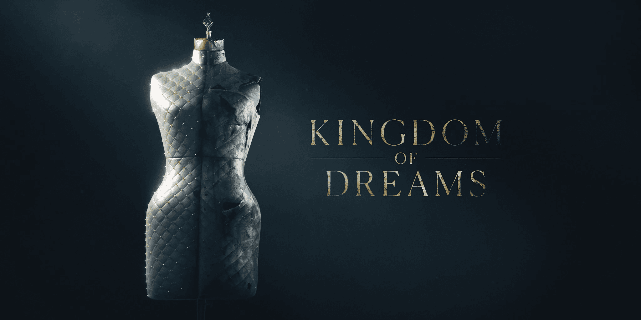
Kingdom of Dreams chronicles the money-fuelled creative boom of the global fashion industry from the 1990s to the 2010s, capturing both its glamour and its darker undercurrents.
Kingdom of Dreams chronicles the money-fuelled creative boom of the global fashion industry from the 1990s to the 2010s, capturing both its glamour and its darker undercurrents.
Tyrone Magnusen — Motion Designer
Chris Sharpe — Creative Director
Phoebe Lane — Producer
Julian Samos — 3D Lead
SHOWREEL
PROJECT OVERVIEW
Towards the latter stages of the cinematics, the Territory team and I began shifting our focus to the intro load movie. These sequences introduced the main characters and helped set the tone for the game. With our deconstructed visual style already well established, this was an opportunity to push it further, experiment with new ideas and develop fresh assets for the title sequence.
We carried over the same hands-on, tactile approach from earlier stages, creating textures by hand using arts and crafts tools before scanning them in to build our own custom library. Fingerprints, smudges, copier misalignments, scratches, paint splats and paper grain all became part of the visual language. These elements helped give the intro its gritty, grounded aesthetic, maintaining a consistent look throughout.
We began with clean, graphic compositions before gradually breaking them down through misalignment, distortion, layering and imperfections. This gave the visuals a sense of weight and history, making them feel like a natural part of the game's world.
The final sequence above features a selection of work I contributed to, combining 2D and 3D workflows depending on the needs of each shot.
Below is a behind the scenes video put together by a good friend and colleague at Territory Studio, offering a closer look at the creative process and development of the visuals.
Further down, I've included a selection of individual shots that I personally created and led, highlighting my contributions to the sequence in more detail.
For the Black Ops 6 intro, we built a hand-made visual language from scanned textures, rough type, and layered imperfections.
PROJECT OVERVIEW
To establish the tone and visual language of the series, we were tasked with creating the title sequence as well as a set of cutaways that would enhance the storytelling across all four episodes.
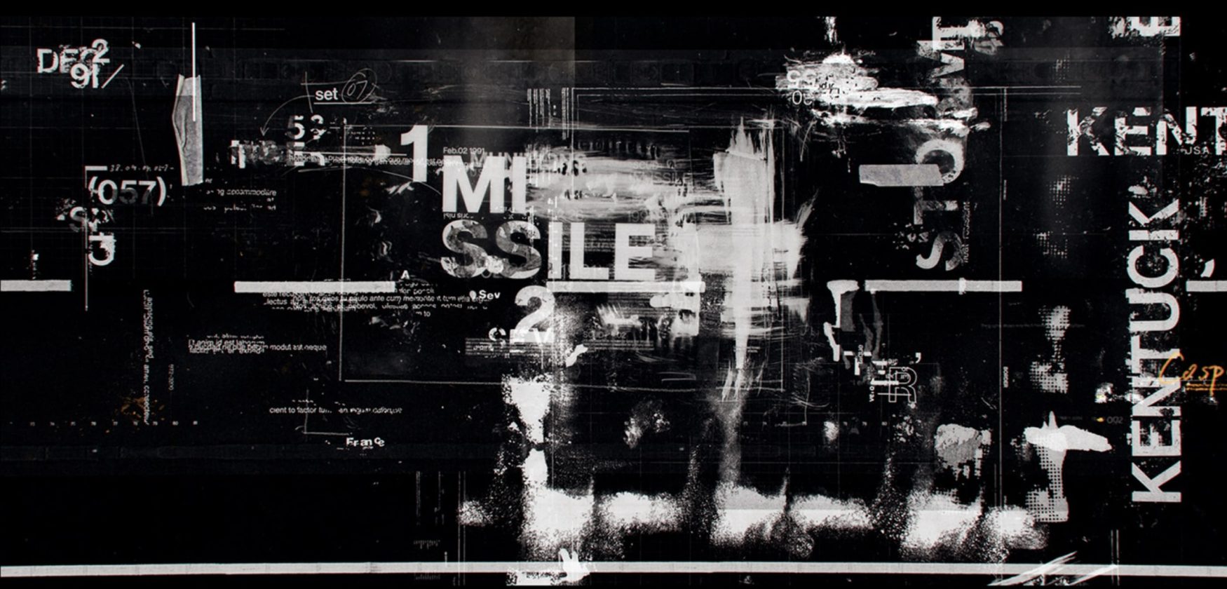
The title sequence needed to reflect the duality at the heart of the story: the artistry and beauty of fashion on one side, and the commercial power and high-stakes drama on the other. We developed a visual language that merged archival textures, bold typography, and carefully considered motion to embody the era’s energy while setting up the themes of conflict, creativity, and ambition explored in the documentary.
Alongside the titles, we created a library of cutaway moments designed to weave seamlessly into the narrative, giving the filmmakers visual tools to reinforce key ideas and transitions. These cutaways acted as graphic punctuation marks throughout the series, offering the audience a visual reminder of the industry’s dynamism and volatility.
By combining strong design with storytelling, our work helped define the identity of Kingdom of Dreams, creating a consistent aesthetic thread that supported and elevated the documentary’s exploration of fashion’s most transformative decades.
PROJECT OVERVIEW
To establish the tone and visual language of the series, we were tasked with creating the title sequence as well as a set of cutaways that would enhance the storytelling across all four episodes.
The title sequence needed to reflect the duality at the heart of the story: the artistry and beauty of fashion on one side, and the commercial power and high-stakes drama on the other. We developed a visual language that merged archival textures, bold typography, and carefully considered motion to embody the era’s energy while setting up the themes of conflict, creativity, and ambition explored in the documentary.
Alongside the titles, we created a library of cutaway moments designed to weave seamlessly into the narrative, giving the filmmakers visual tools to reinforce key ideas and transitions. These cutaways acted as graphic punctuation marks throughout the series, offering the audience a visual reminder of the industry’s dynamism and volatility.
By combining strong design with storytelling, our work helped define the identity of Kingdom of Dreams, creating a consistent aesthetic thread that supported and elevated the documentary’s exploration of fashion’s most transformative decades.
PROJECT OVERVIEW
We created the title sequence and cutaways for the four-part documentary, combining archival textures, bold typography and motion to capture the beauty, ambition and commercial intensity of the fashion industry.
By combining strong design with storytelling, our work helped define the identity of Kingdom of Dreams, creating a consistent aesthetic thread that supported and elevated the documentary’s exploration of fashion’s most transformative decades.
TEXTURE
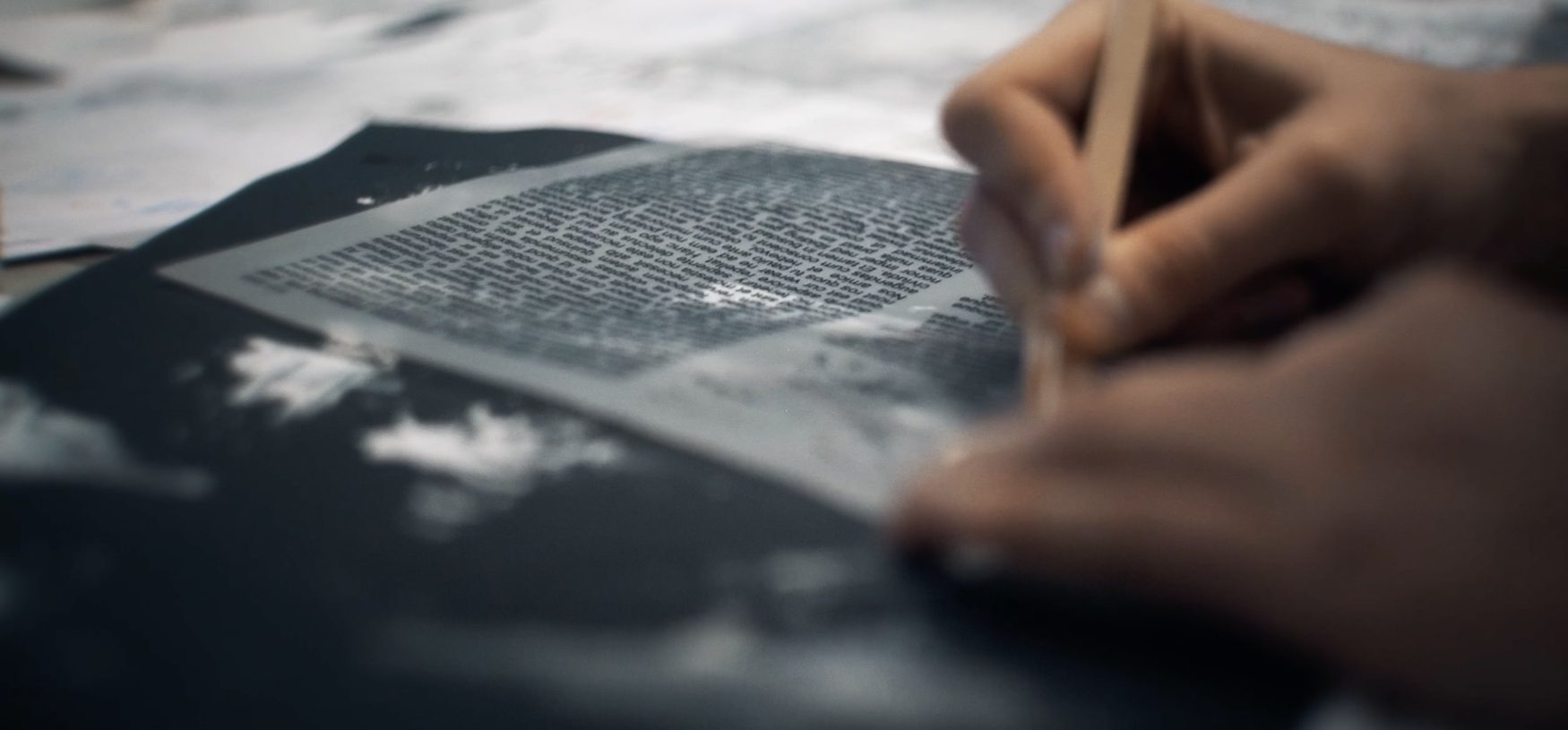
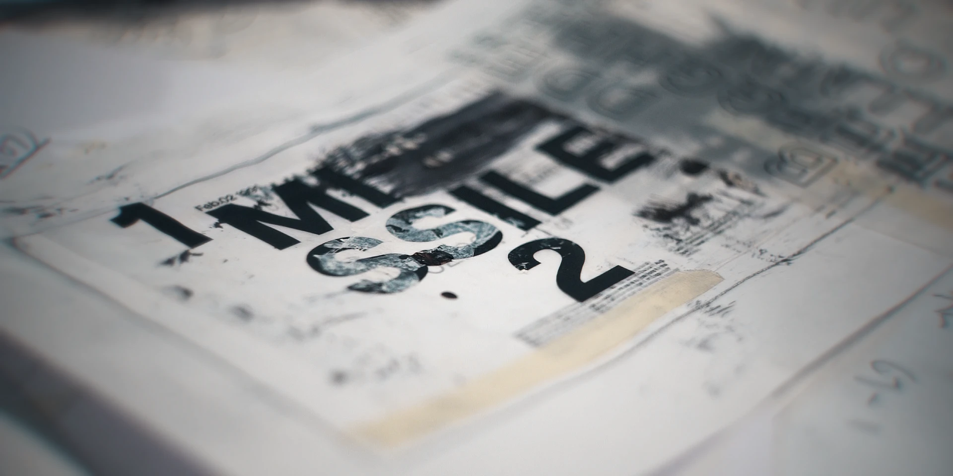
Some of the textures we created came from experimenting with Letraset, paint, scanned acetate and various other arts and crafts techniques. These hands-on processes allowed us to explore different materials and build a library of unique textures to incorporate into the visuals.
TEXTURE
Some of the textures we created came from experimenting with Letraset, paint, scanned acetate and various other arts and crafts techniques. These hands-on processes allowed us to explore different materials and build a library of unique textures to incorporate into the visuals.
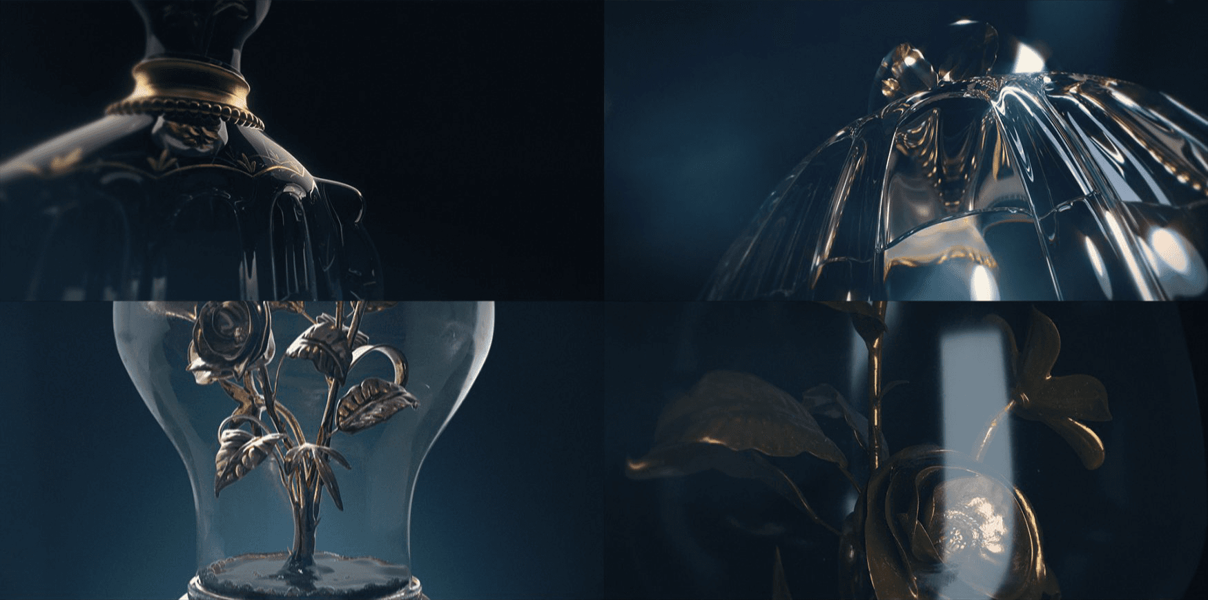
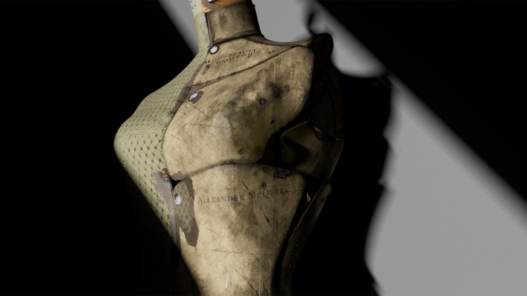
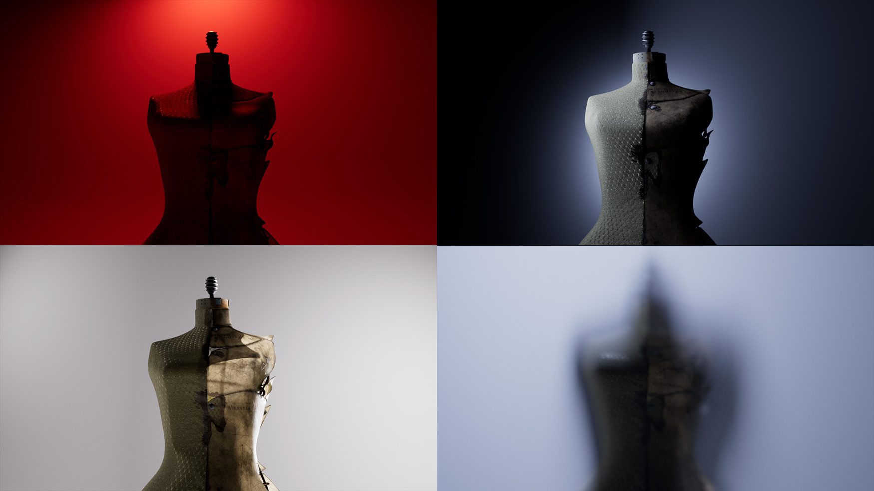
Each asset was designed to represent key plot points within the series. A tailor’s mannequin serves as the centrepiece—one half draped in elegant fabric, the other distressed and decayed.The sequence unfolds as a visual thread, weaving together the dramatic rise and fall of the industry’s major players. Beginning with glamour and excess, silhouettes and animations gradually unravel a darker underbelly, hinting at themes of money, power, and scandal.


More works


Back to home