Disclosure Day

CLIENT

Universal Pictures

OVERVIEW

CREDITS

Disclosure Day is the latest science fiction thriller directed by the world renowned director Steven Spielberg. To which, I had the pleasure of creating the largest surveillance UI for the giant on set LCD screens within the control room. As well as sci-fi brain monitoring UI which were a key story telling component for the film. The unique aspect of the project is that all our work was delivered before filming and I was on set throughout it to facilitate our graphics during filming and respond quickly to ideas of Spielberg himself.

Disclosure Day is the latest science fiction thriller directed by the world renowned director Steven Spielberg. To which, I had the pleasure of creating the largest surveillance UI for the giant on set LCD screens within the control room. As well as sci-fi brain monitoring UI which were a key story telling component for the film. The unique aspect of the project is that all our work was delivered before filming and I was on set throughout it to facilitate our graphics during filming and respond quickly to ideas of Spielberg himself.

Tyrone Magnusen — Senior Motion Designer

Ryan Hays — Creative Director

Jorge Almeida — Art Director

Harriet Craig — Lead Producer

Francise Long — Motion Designer

Sophie Marschner — Motion Designer

Alasdair Willson — Motion Designer

Tyrone Magnusen — Senior Motion Designer

Ryan Hays — Creative Director

Jorge Almeida — Art Director

Harriet Craig — Lead Producer

Francise Long — Motion Designer

Sophie Marschner — Motion Designer

Alasdair Willson — Motion Designer

SHOWREEL

Project Overview

Towards the latter stages of the cinematics, the Territory team and I began shifting our focus to the intro load movie. These sequences introduced the main characters and set the tone for the game. With our deconstructed visual style already well established, this was a chance to push it further and have some fun developing fresh assets for the title sequence.

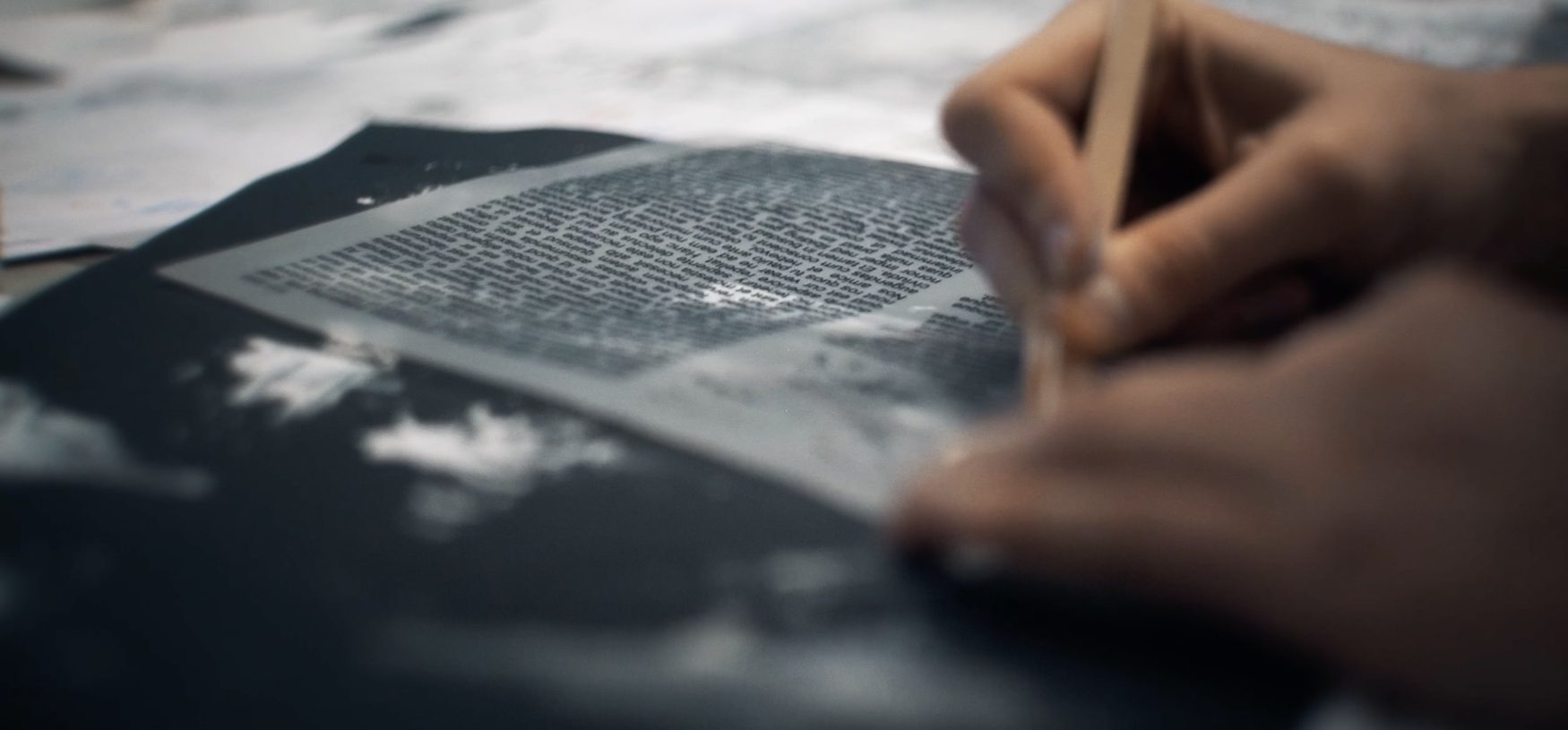
We carried over the same hands-on, tactile approach from earlier stages — creating textures by hand using arts and crafts tools, then scanning them in to build our custom library. Fingerprints, smudges, copier misalignments, scratches, paint splats, and paper grain all made it in. These elements gave the intro that same gritty, grounded aesthetic that tied everything together.

We started with clean, graphic compositions and then broke them down — misaligning elements, adding distortion, layering in wear and imperfections. It gave the UI a sense of weight and history, like it belonged in the world of the game.

The final sequence above is a selection of the work I contributed to — blending 2D and 3D workflows depending on what each moment needed. Below that, there’s a lovely behind-the-scenes video put together by a good friend and colleague at Territory Studio, offering a closer look at the process behind the visuals.

For the Black Ops 6 intro, we built a hand-made visual language from scanned textures, rough type, and layered imperfections.

WARDEX CONTROL ROOM


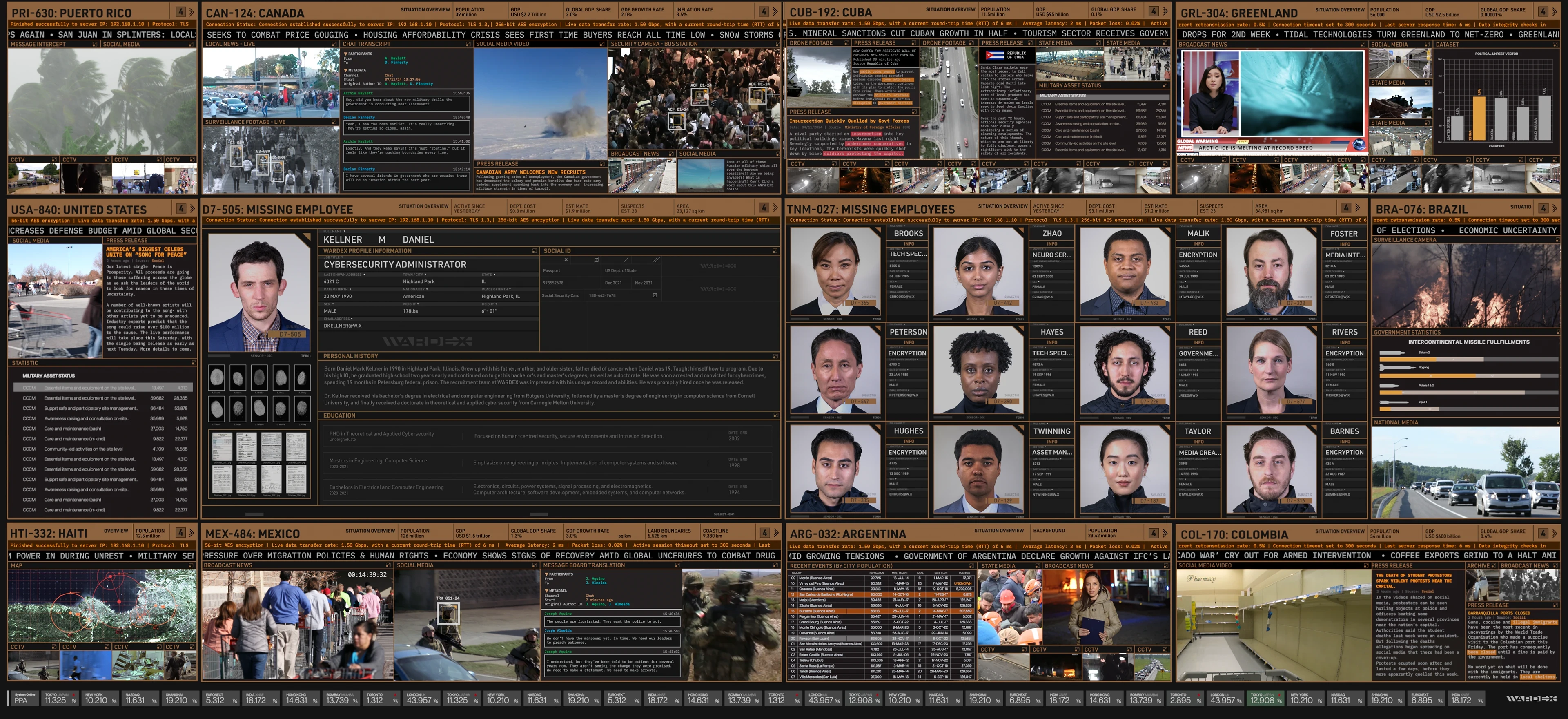
The set contained give giant LED screens on one side of the room with over 80 agent work station. The giant LED screens had to monitor newsfeeds and tv networks from around the world. Essentially serving as the eyes of the Wardex headquarters. I was on from the initial concept where we were sent a relatively simple concept from the art department but it highlighted the direction Spielberg wanted to take. He was keen to break out of the typical 'blue sci-fi' screens and do something that's completely different. The pallet wanted to be warm, vibrant and showcase the different alert levels through colour.


DEVELOPMENT


My initial concepts for these screens where not far of the final but below you can see i led towards bolder titles and text across the headlines. My colours were also more saturated to highlight the changes in alert levels, yellow being the lowest state. orange medium and red high alert, also indicated by the numbering system. When there would be a red alert the rest of the screen would dim to highlight the urgency of the new information.
I aimed for the animation to feel modular with a system to how the new pieces of footage would enter within the countries. The intention was for it feel like an organse OS system wwithin the chaos of information.


Feed we recieved from renowned prduction designer Adam Sotckhausen was that Spielberg wants the pallete to feature the 'cork' colour as the foundation. We were curious as to why until we saw how beautifully it worked with the rest of the set design. The next rounds show the design changed towards that direction and then lastly the final design that became championed by our art director Jorge Almeida to completion.


My role developed to thinking about how we implement the hero graphics within the looping background elements. We were given parts of the script to design how the screens would react to whats happening in the screen. the aim within these concepts for it to feel part of the background loop. it was to grow from center and become the focal point. During this team we had many calls with playback team in New York on how we would supply these graphics to them so they can time and play each action on set during filming. Highlighting the challenge we faced of supplying ready graphics for shoot without any post production. Spielberg was keen to have the graphics there live as he films as this ensured the graphics could be seen through reflections across the large Wardex headquarters.

COLD ROOM GFX


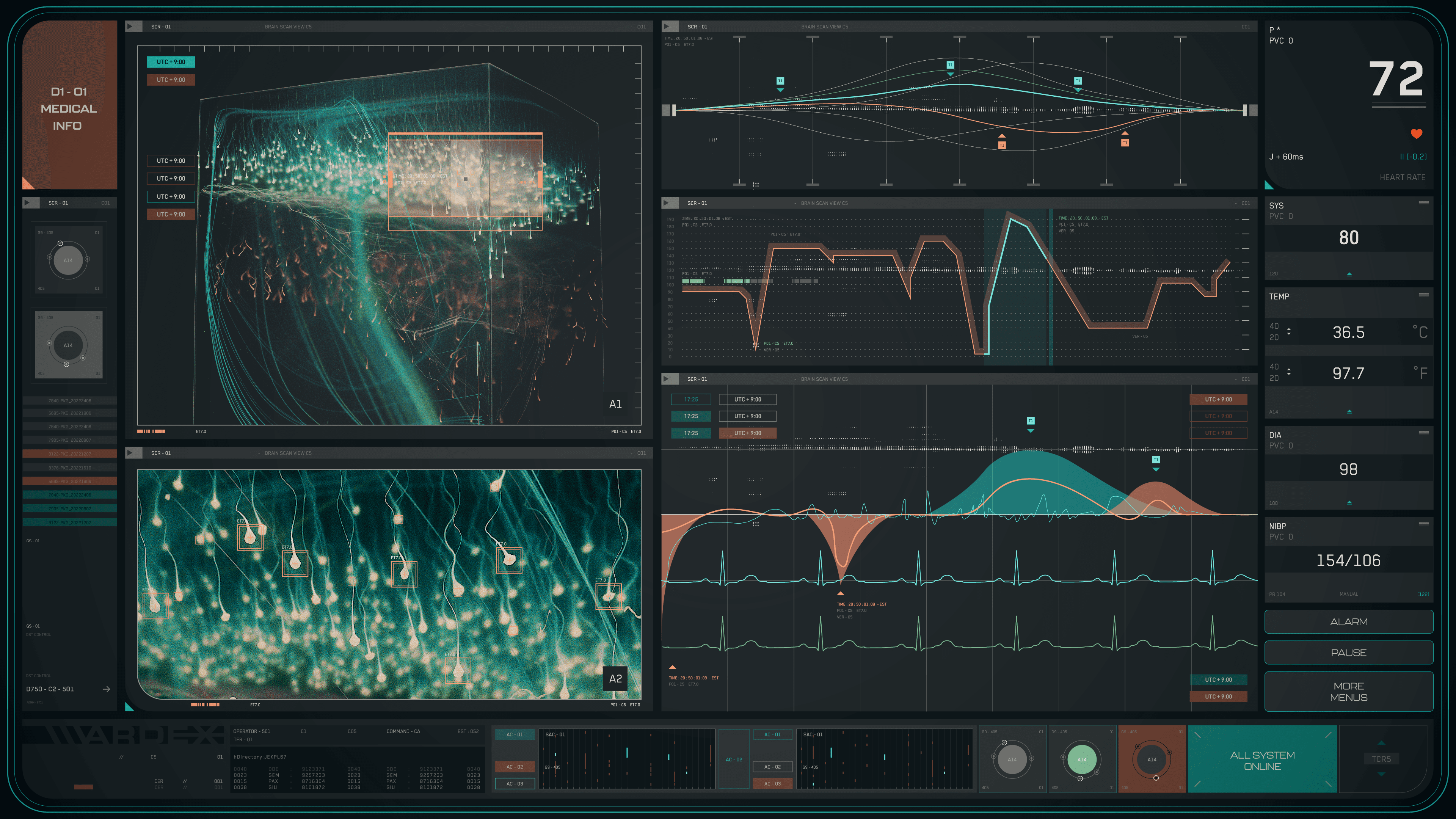
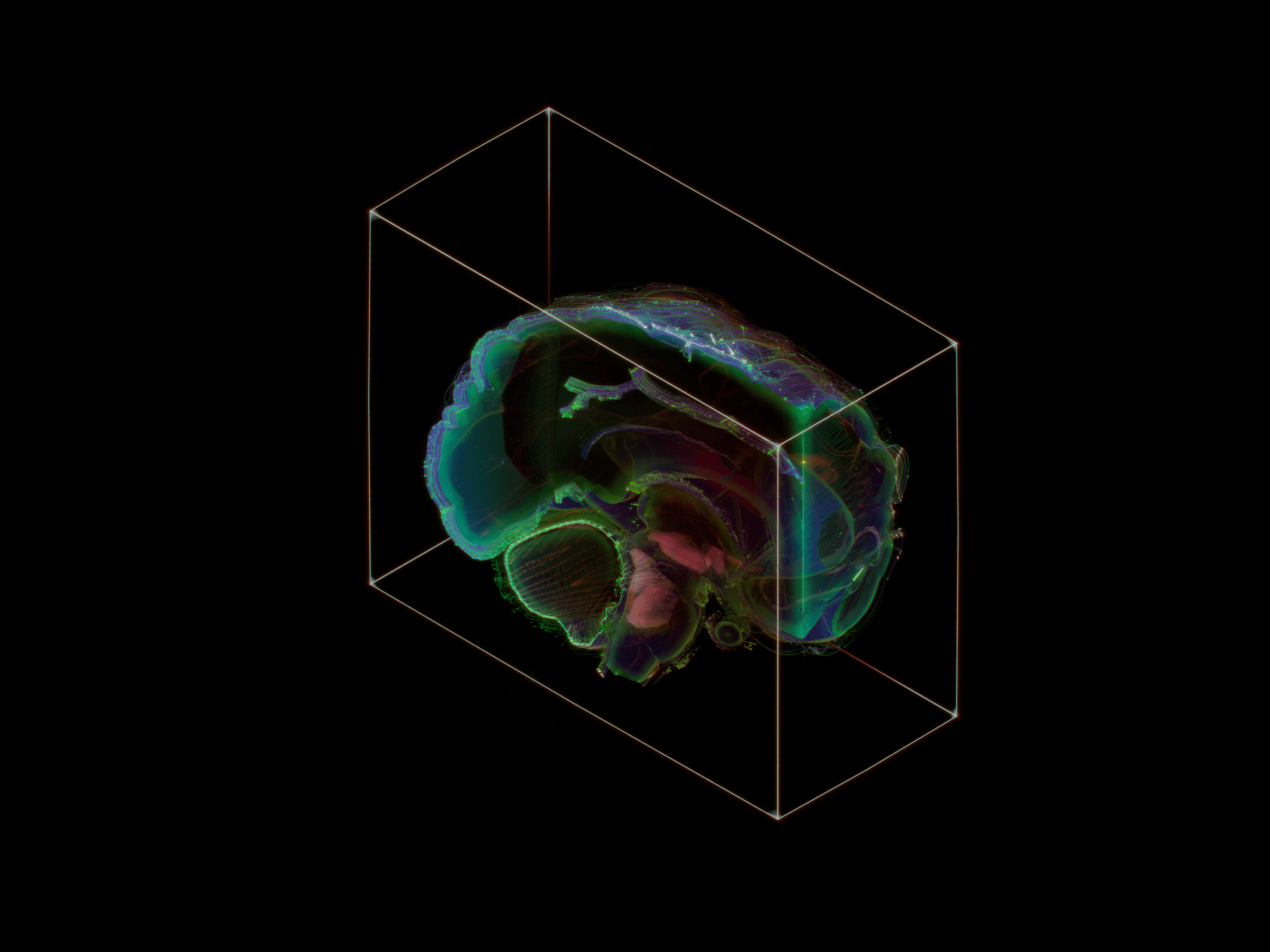
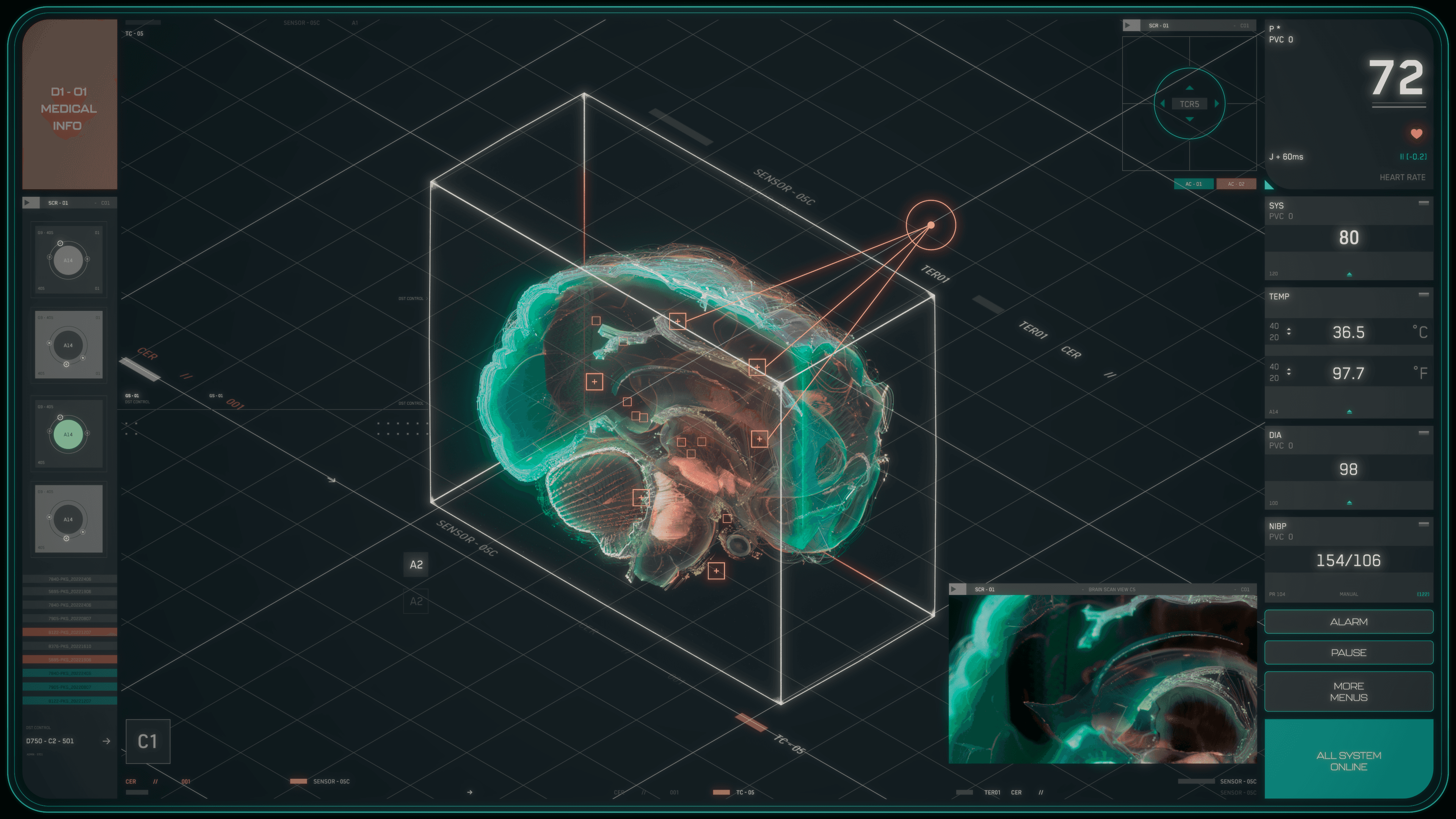
The cold room graphics consisted of brain monitoring interfaces for the medical facility within the Wardex organisation. The use of a found mind control device would cause great strain to the users brain and so the vitals had to be closely monitored whenever used. I created all the 3D look and animation of the brain activity during usage. With Francise Long working on the 2D UI interface.


BRAIN SCAN RENDER IN NORMAL AND ALERTED STATE


CONCEPTS AND DEVELOPMENT


More works

Back to home