©2026 Tyrone
Caesarstone
CLIENT
Caesarstone
OVERVIEW
CREDITS
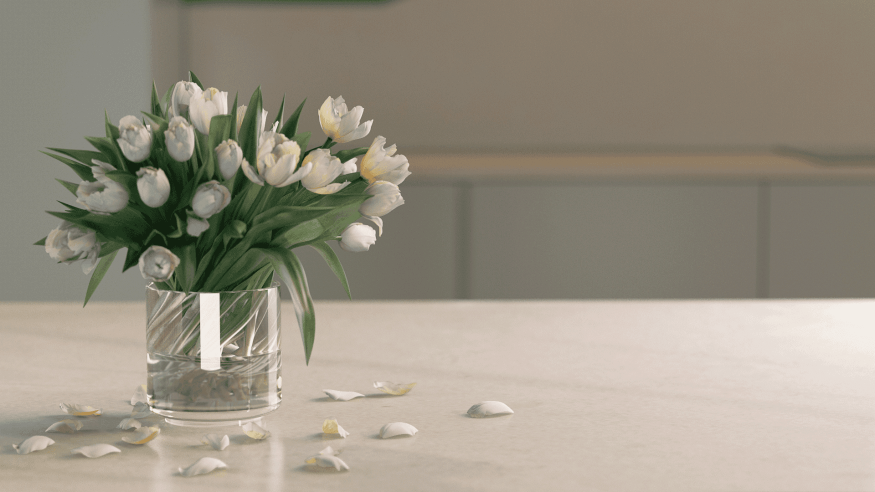
Caesarstone specialises in using natural raw minerals to craft durable, high-quality countertops. They commissioned a brand film to showcase not only the craftsmanship and strength of their surfaces but also the artistry behind them. Our approach was to create an environment that reflected the character of the collection, balancing functionality with an expressive, design-led sensibility.
Caesarstone specialises in using natural raw minerals to craft durable, high-quality countertops. They commissioned a brand film to showcase not only the craftsmanship and strength of their surfaces but also the artistry behind them. Our approach was to create an environment that reflected the character of the collection, balancing functionality with an expressive, design-led sensibility.
Tyrone Magnusen — Motion Designer
Ambro Bergmaschi — Art Director
Phoebe Lane — Producer
Ion Opera — Motion Designer
James Mathias — Motion Designer
SHOWREEL
Project Overview
Towards the latter stages of the cinematics, the Territory team and I began shifting our focus to the intro load movie. These sequences introduced the main characters and set the tone for the game. With our deconstructed visual style already well established, this was a chance to push it further and have some fun developing fresh assets for the title sequence.
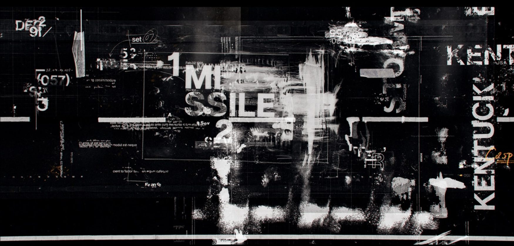
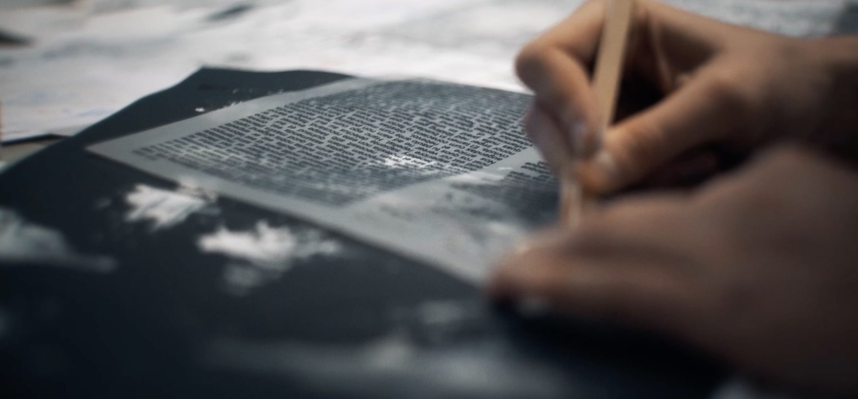
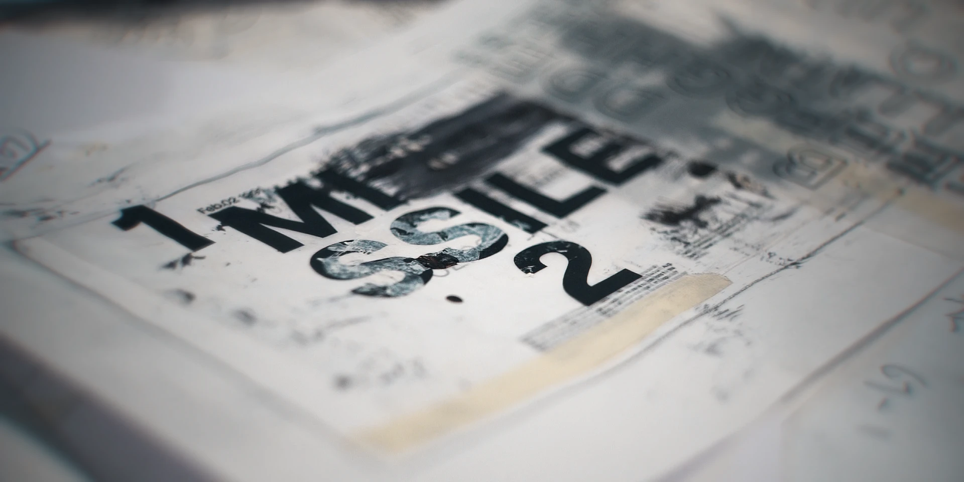
We carried over the same hands-on, tactile approach from earlier stages — creating textures by hand using arts and crafts tools, then scanning them in to build our custom library. Fingerprints, smudges, copier misalignments, scratches, paint splats, and paper grain all made it in. These elements gave the intro that same gritty, grounded aesthetic that tied everything together.
We started with clean, graphic compositions and then broke them down — misaligning elements, adding distortion, layering in wear and imperfections. It gave the UI a sense of weight and history, like it belonged in the world of the game.
The final sequence above is a selection of the work I contributed to — blending 2D and 3D workflows depending on what each moment needed. Below that, there’s a lovely behind-the-scenes video put together by a good friend and colleague at Territory Studio, offering a closer look at the process behind the visuals.
For the Black Ops 6 intro, we built a hand-made visual language from scanned textures, rough type, and layered imperfections.
Project Overview
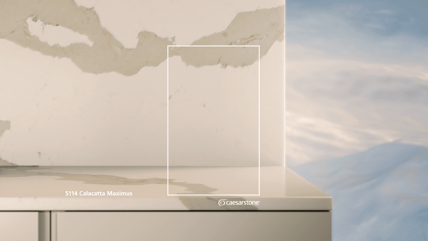
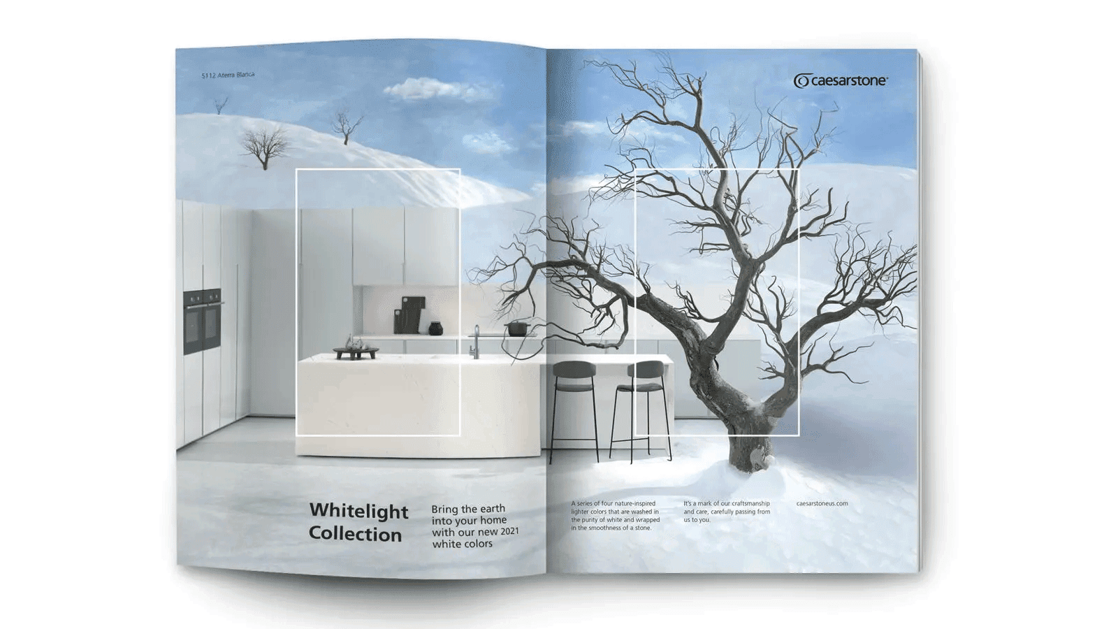
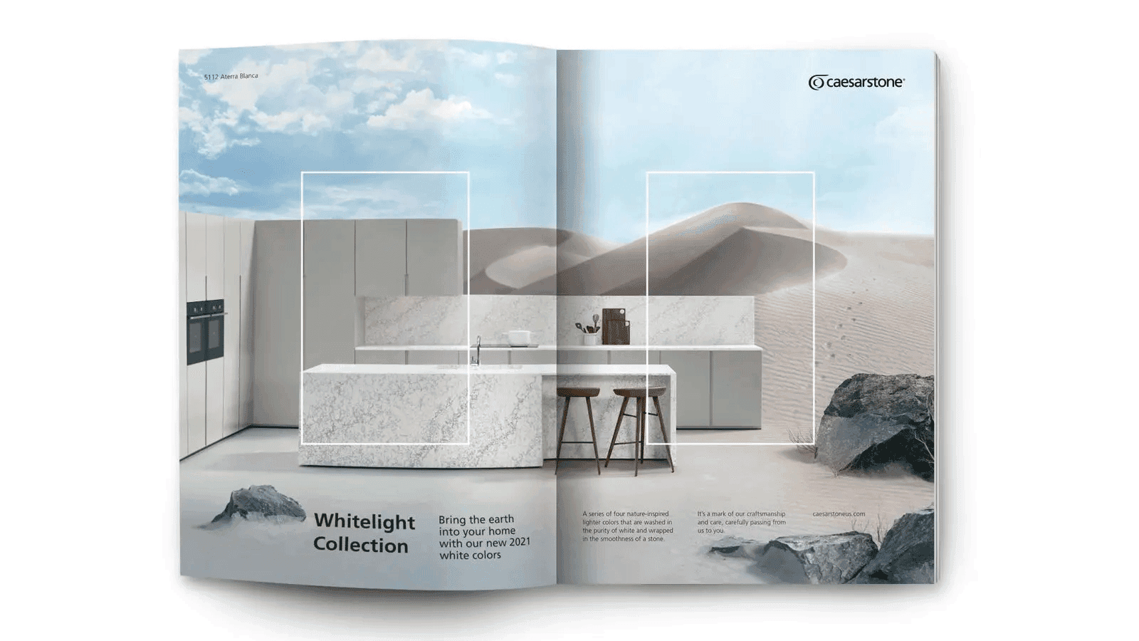
The agency provided clear direction on how they wanted the stones portrayed, including precise camera angles designed to build anticipation while staying within the Caesarstone brand rectangle. Our challenge was to strike the right balance — using light and shadow to create a sense of drama without distracting from the natural beauty of the stone surfaces.
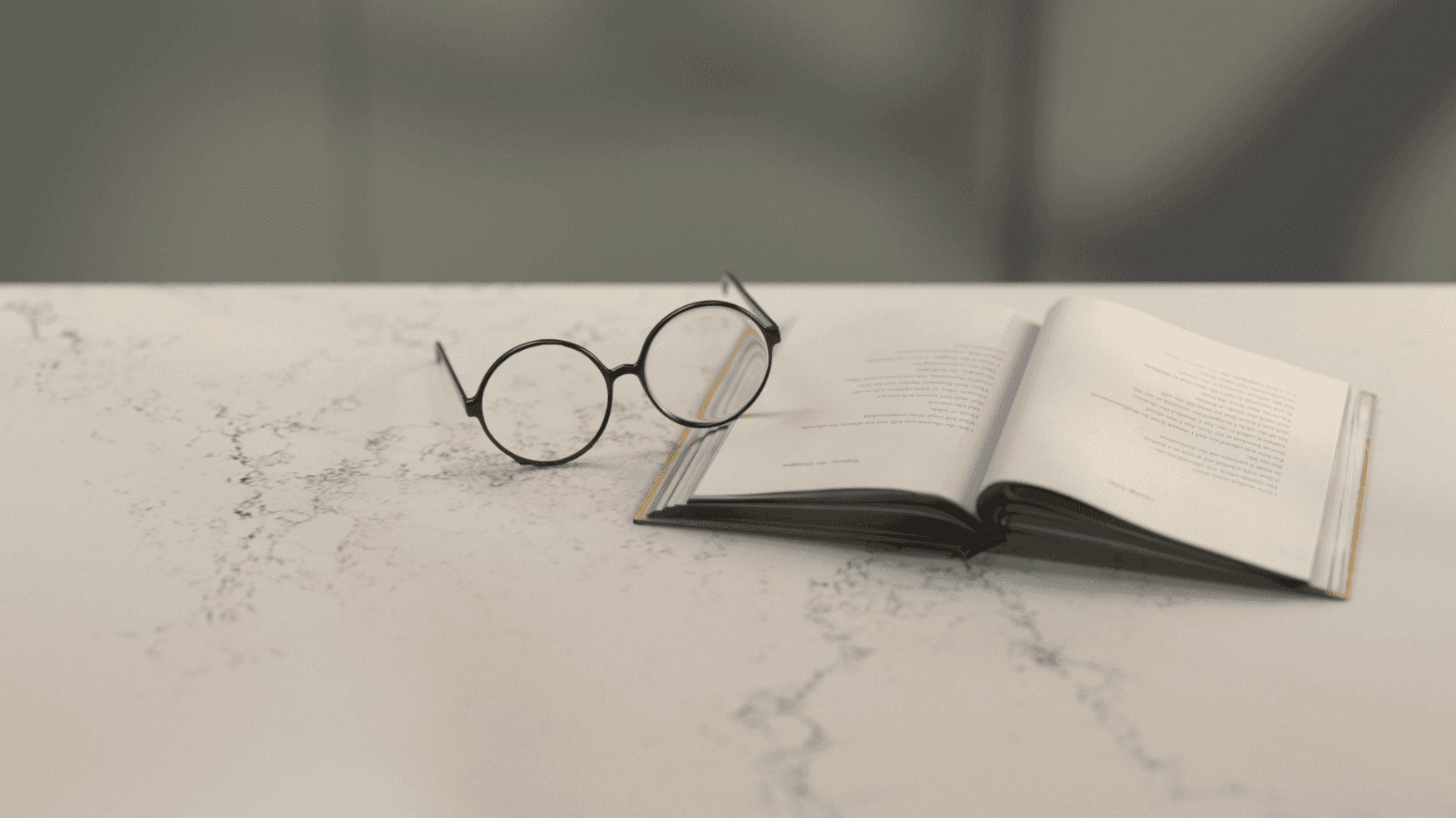
In addition to the film work, I was responsible for producing a series of fully CG stills inspired by classical still-life painting. Everyday objects — fruit, utensils, and kitchenware — were carefully arranged on Caesarstone’s marble surfaces, creating compositions that felt timeless, elegant, and aligned with the brand’s refined identity. These stills extended the campaign’s visual language, adding richness and depth to the overall presentation.
Project Overview
The agency provided clear direction on how they wanted the stones portrayed, including precise camera angles designed to build anticipation while staying within the Caesarstone brand rectangle. Our challenge was to strike the right balance — using light and shadow to create a sense of drama without distracting from the natural beauty of the stone surfaces.
In addition to the film work, I was responsible for producing a series of fully CG stills inspired by classical still-life painting. Everyday objects — fruit, utensils, and kitchenware — were carefully arranged on Caesarstone’s marble surfaces, creating compositions that felt timeless, elegant, and aligned with the brand’s refined identity. These stills extended the campaign’s visual language, adding richness and depth to the overall presentation.



More works


Back to home